TATA REBRAND
2024 年,SIXSIX STUDIO 为 TATA 制定全新品牌升级策略,以品牌长期积累的「爱」为核心,重新梳理品牌历史、品牌 DNA、品牌框架与消费者关系,构建从品牌文化到市场传播的完整表达体系。
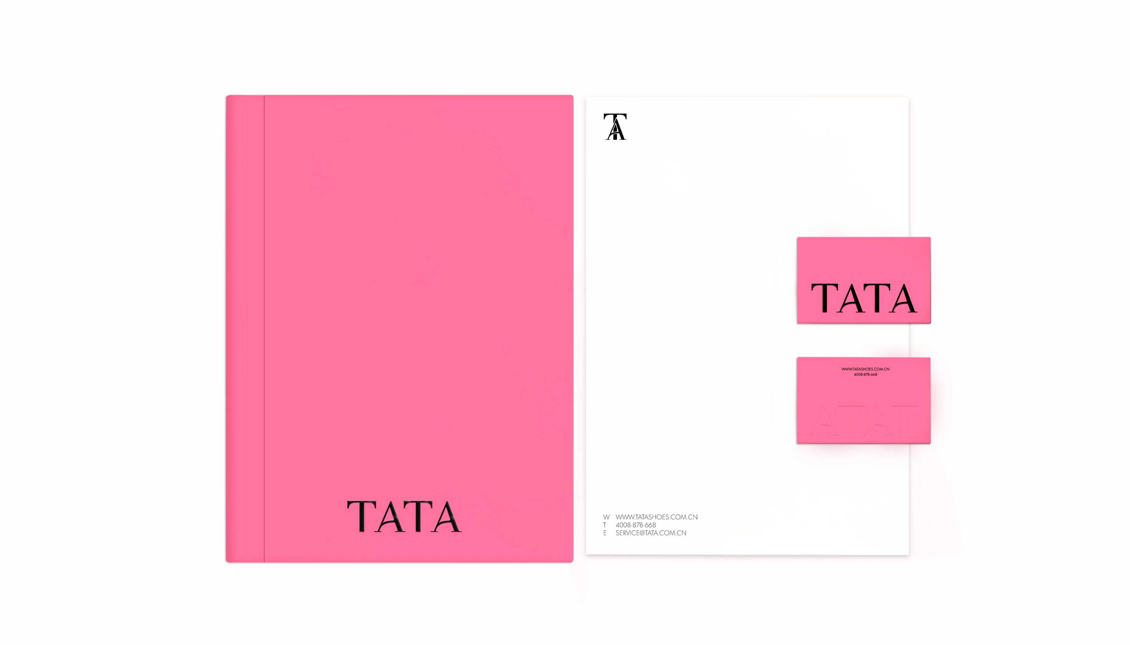
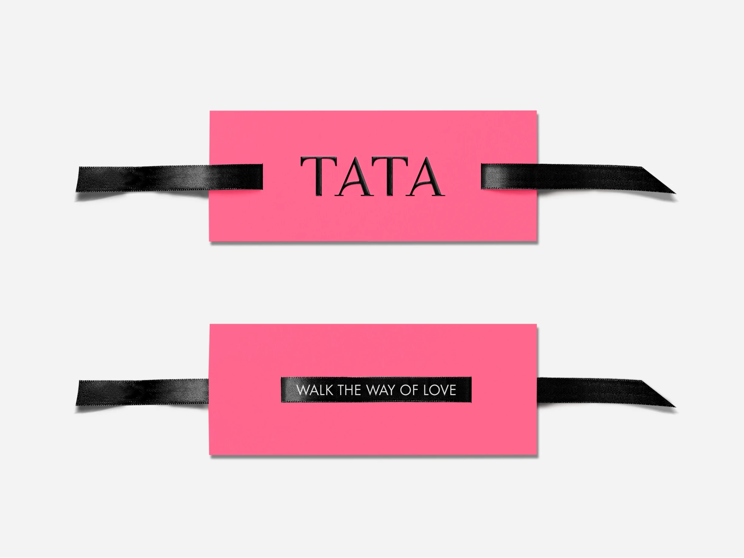
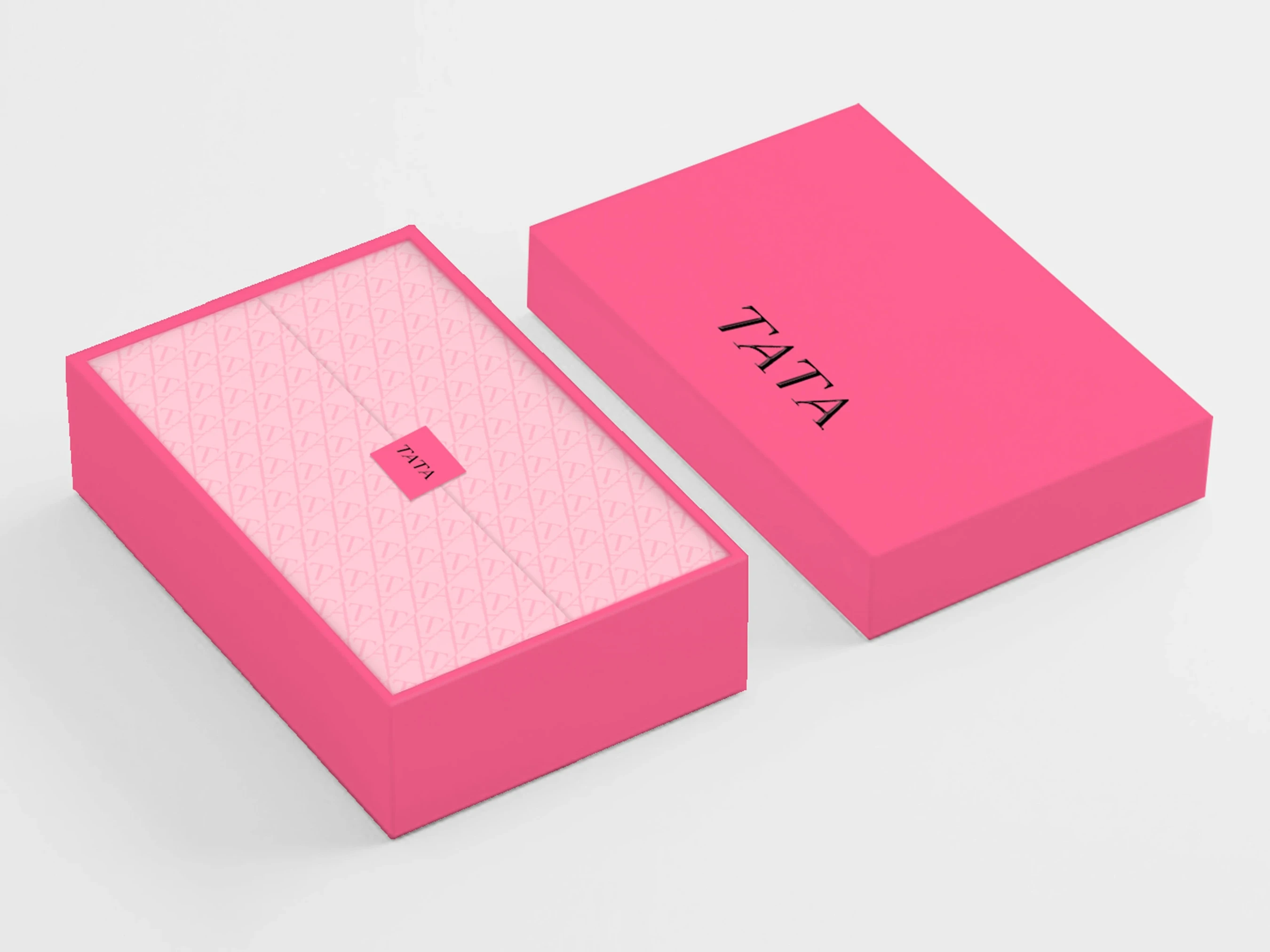
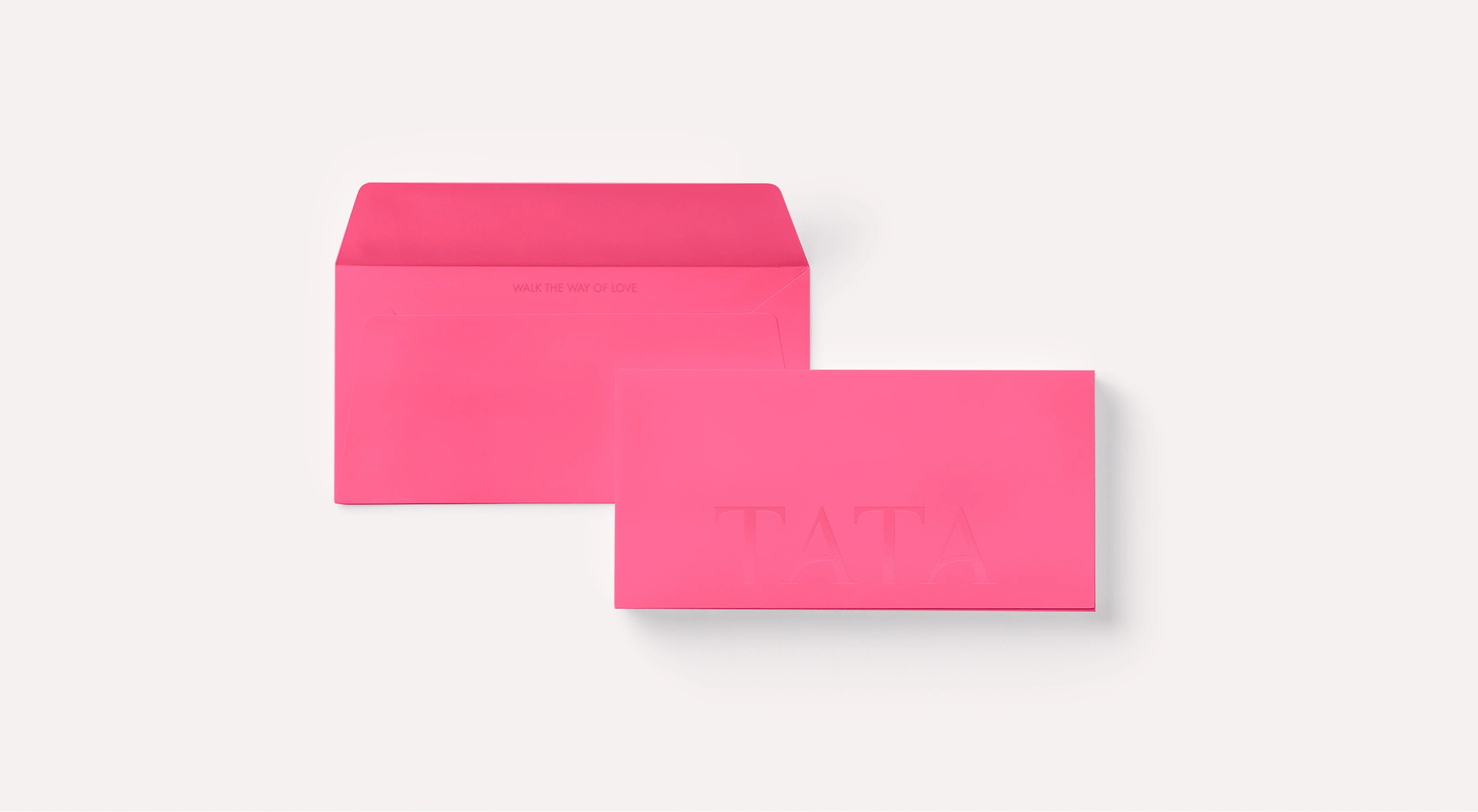
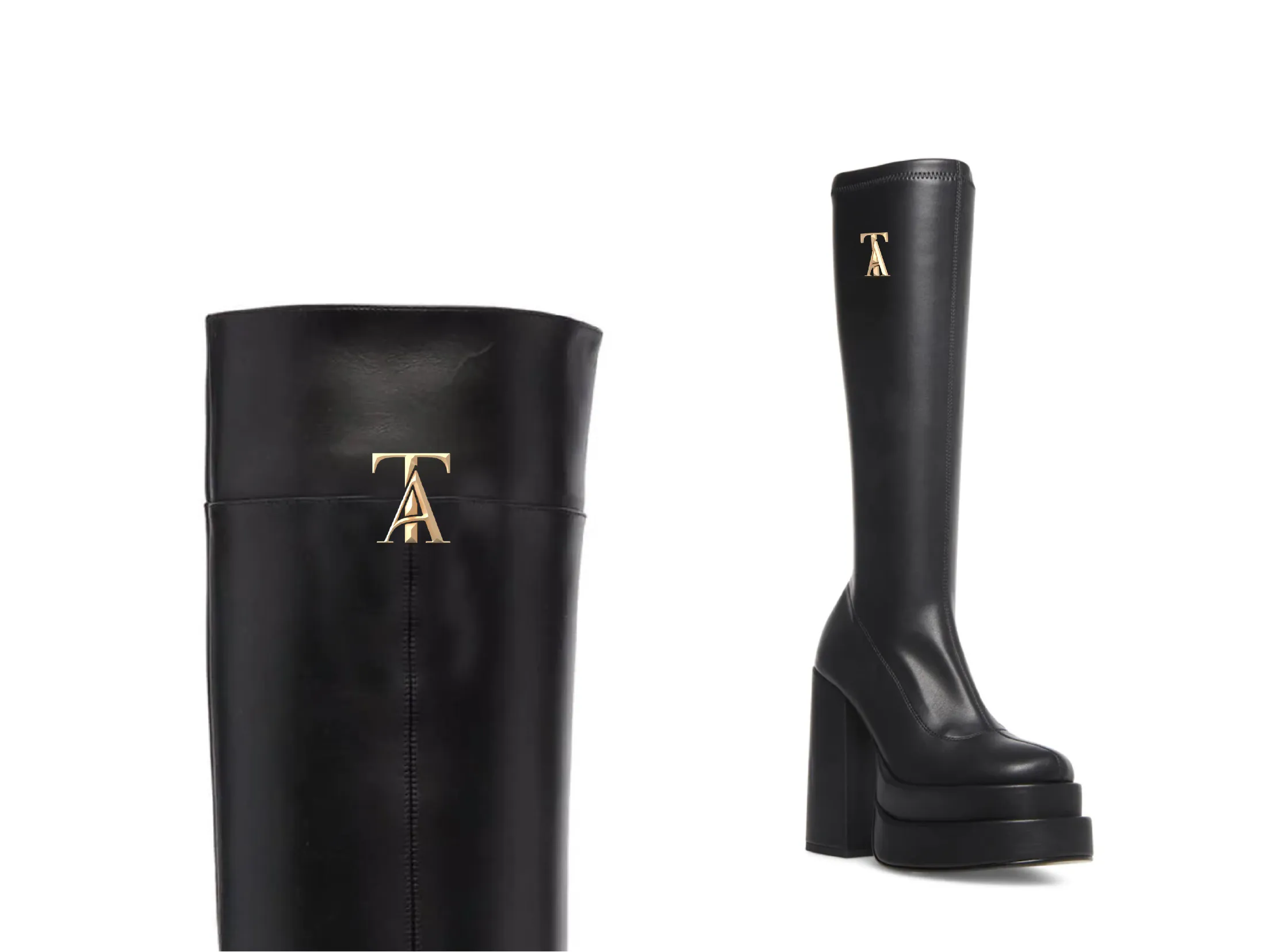
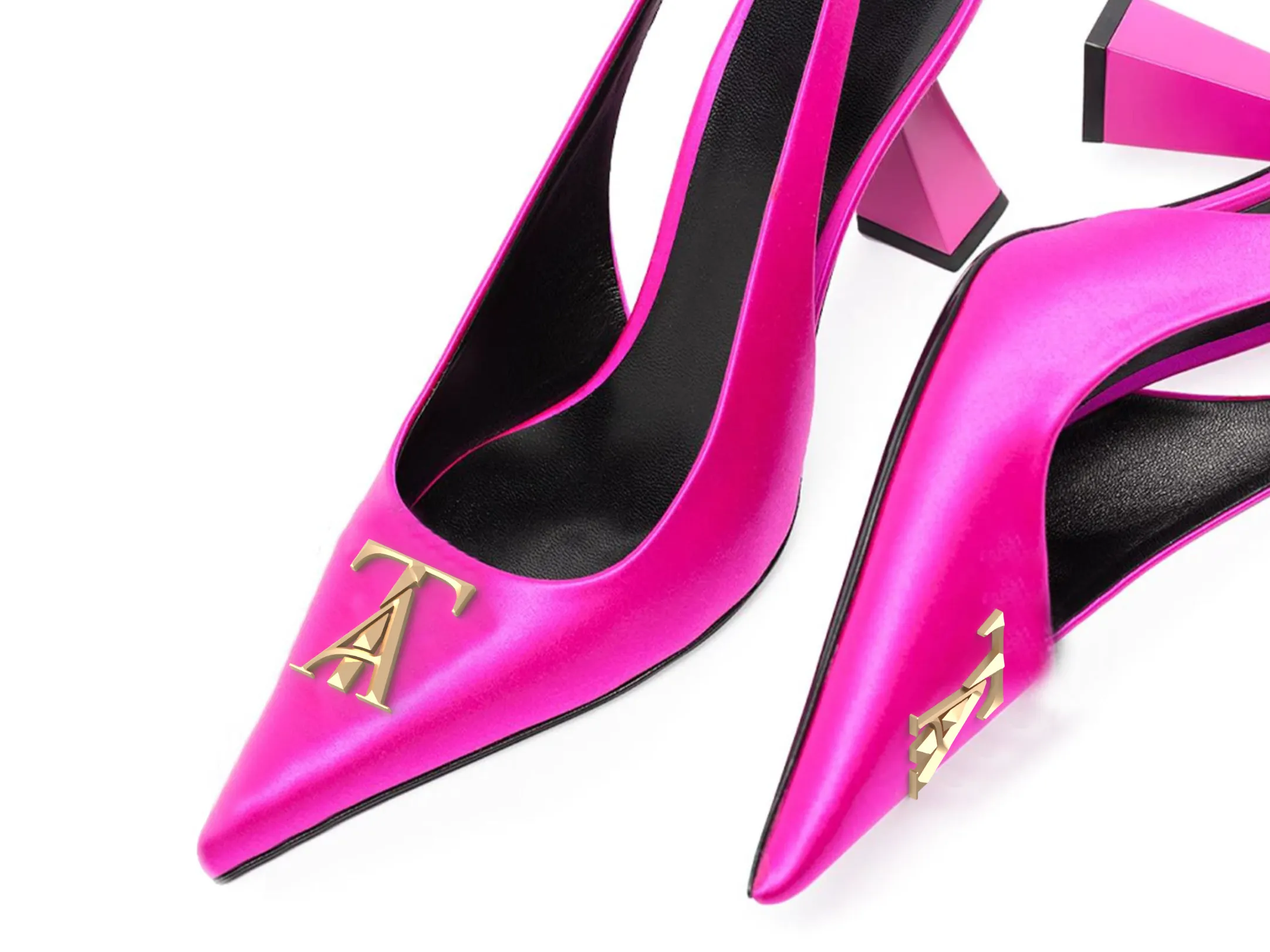
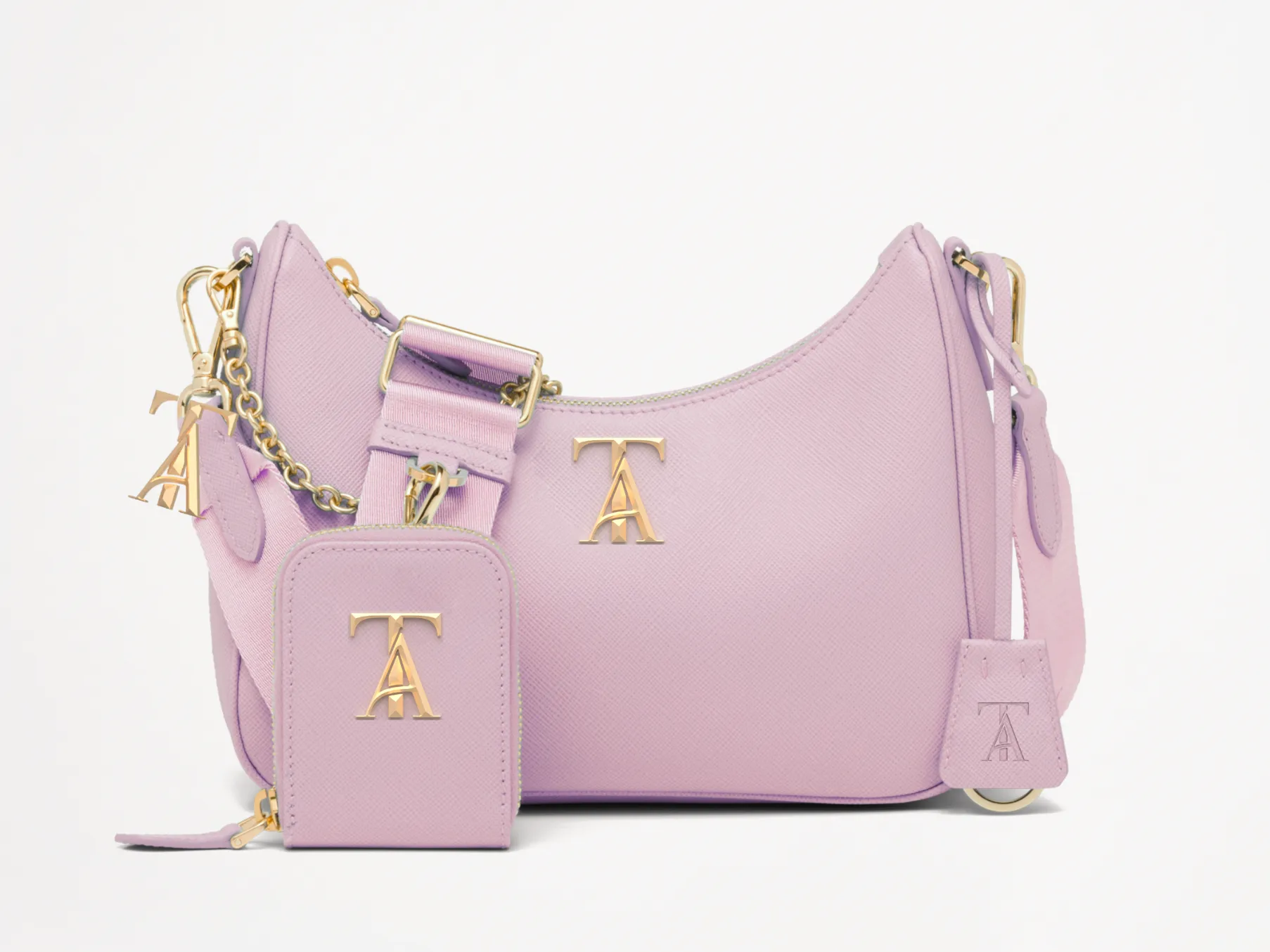
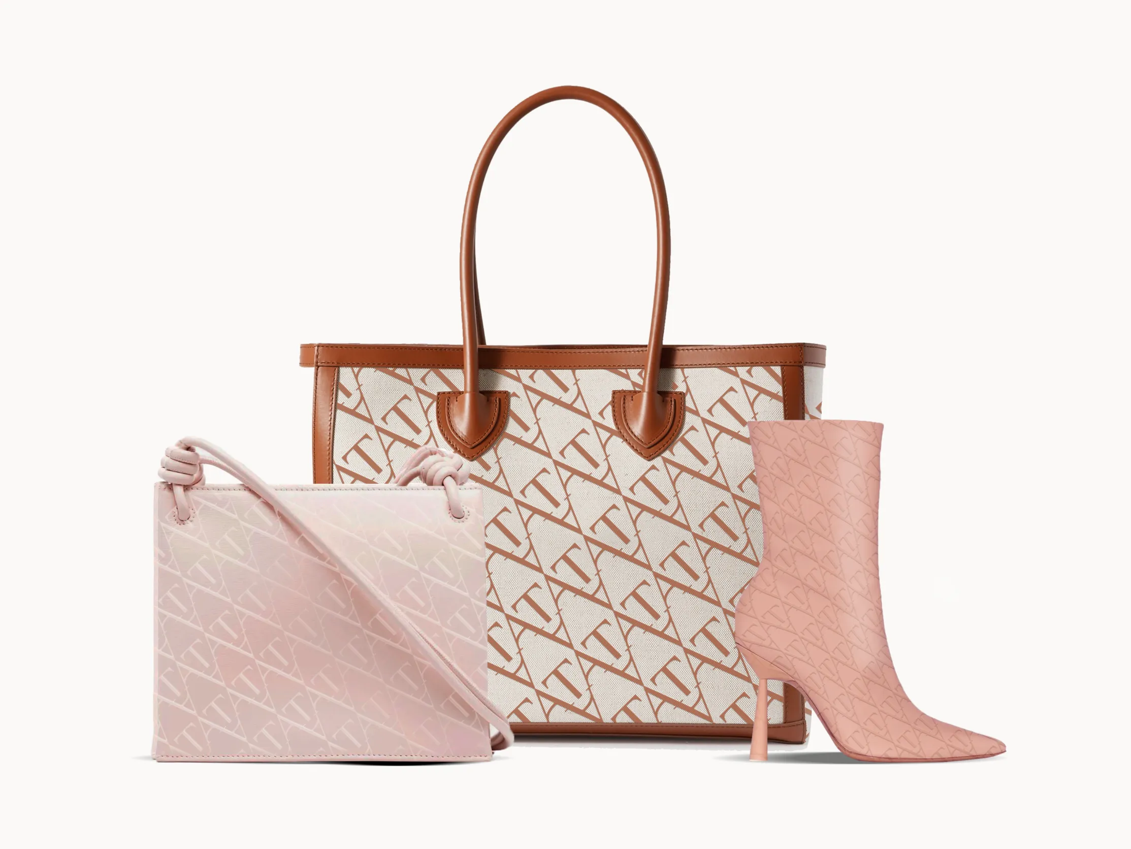
本次升级特别邀请国际创意机构 GB65 操刀设计 TATA 全新 Logo。在此基础上,SIXSIX STUDIO 延展并建立品牌核心视觉、MARK、辅助图形、色彩与字体系统,同时完善品牌形象、产品品类、感官体验及整合营销传播策略,将 TATA 关于浪漫、精致、舒适与社交连接的品牌价值,转译为一套更年轻、更鲜明且可持续使用的品牌资产。
In 2024, SIXSIX STUDIO developed a comprehensive brand renewal strategy for TATA, using the brand’s long-standing belief in love as its cultural foundation. We revisited TATA’s history, brand DNA, positioning, and relationship with its audience to establish a coherent system connecting brand culture, visual identity, product expression, and marketing communication.
For the new brand identity, TATA invited international creative agency GB65 to design its new logo. Building from this foundation, SIXSIX STUDIO developed the wider brand system, including the core visual identity, MARK, supporting graphics, color and typography, brand image, product categories, sensory experience, and integrated communication strategy. The renewed system translates TATA’s values of romance, refinement, comfort, and social connection into a younger, more distinctive, and enduring brand expression.
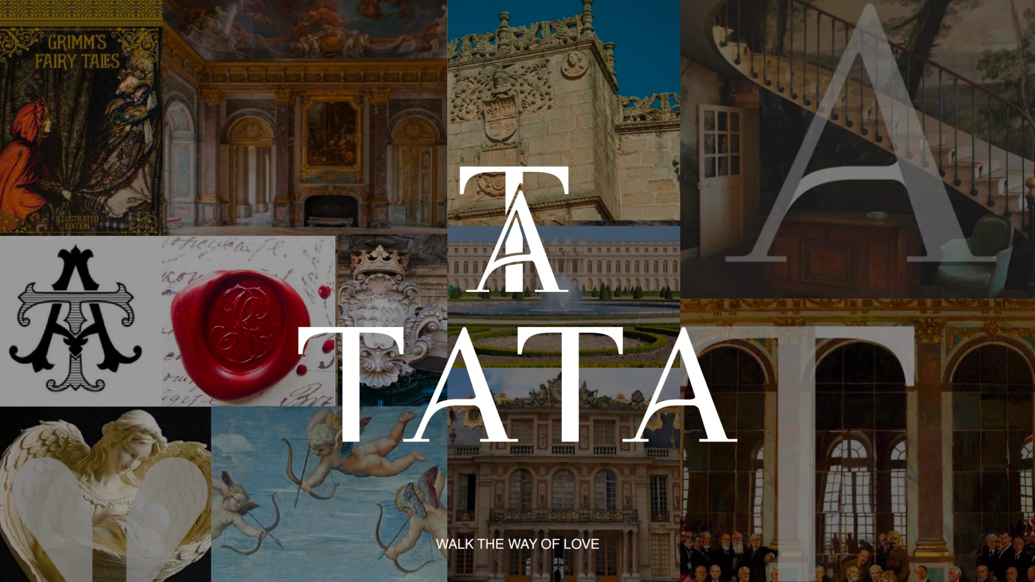
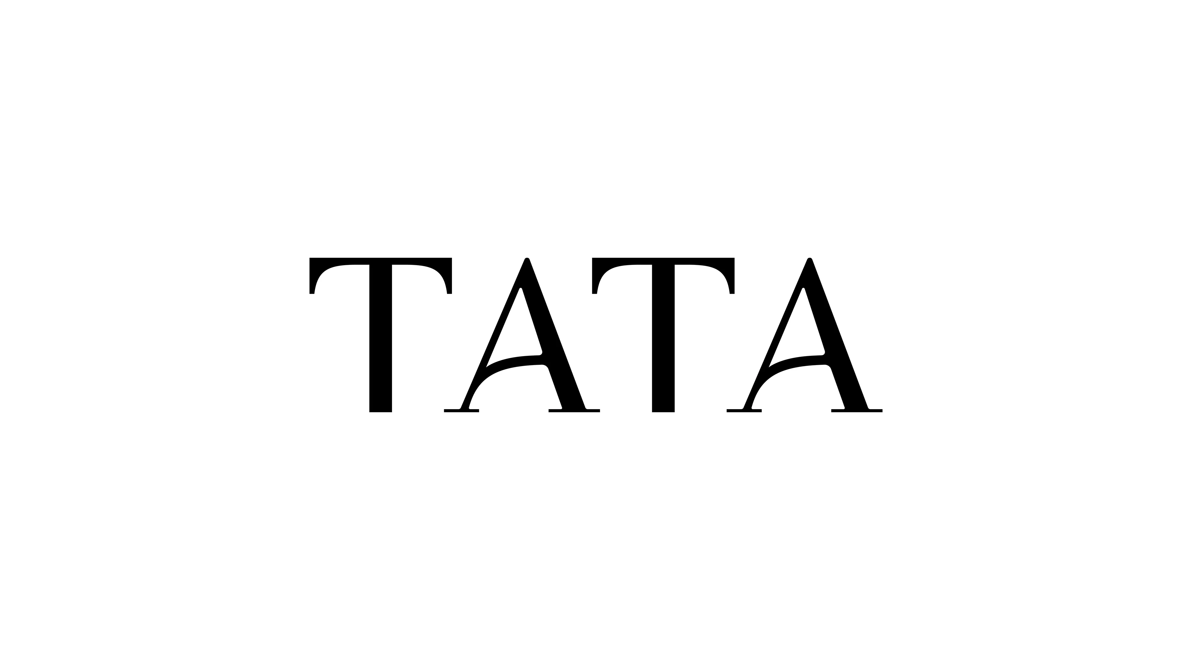
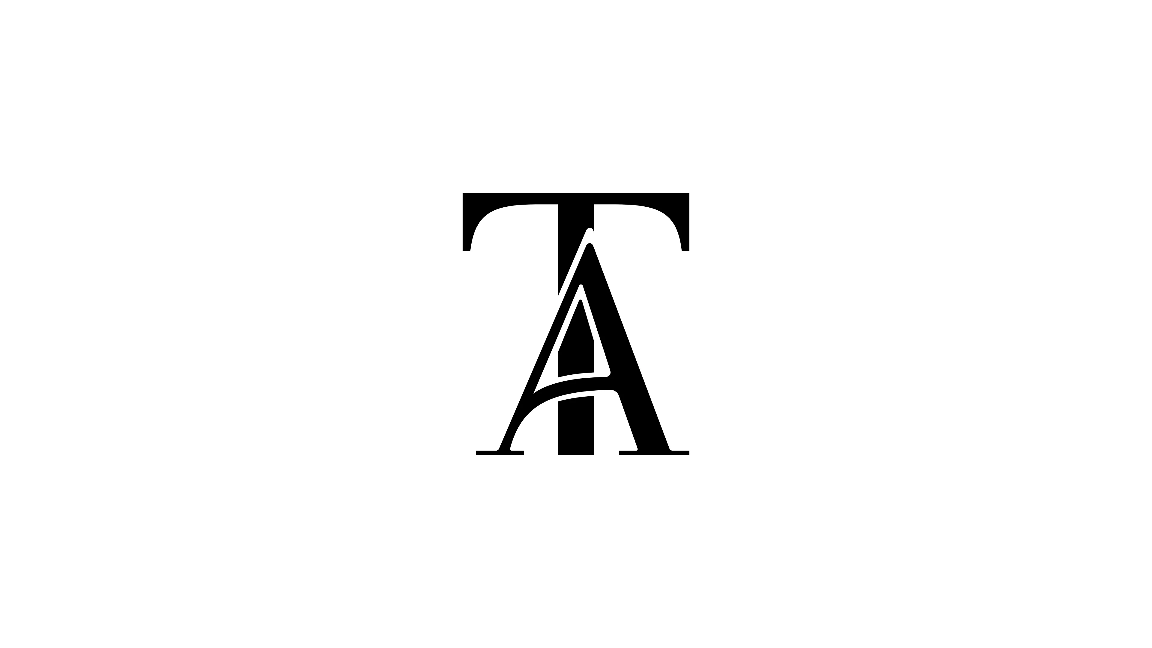
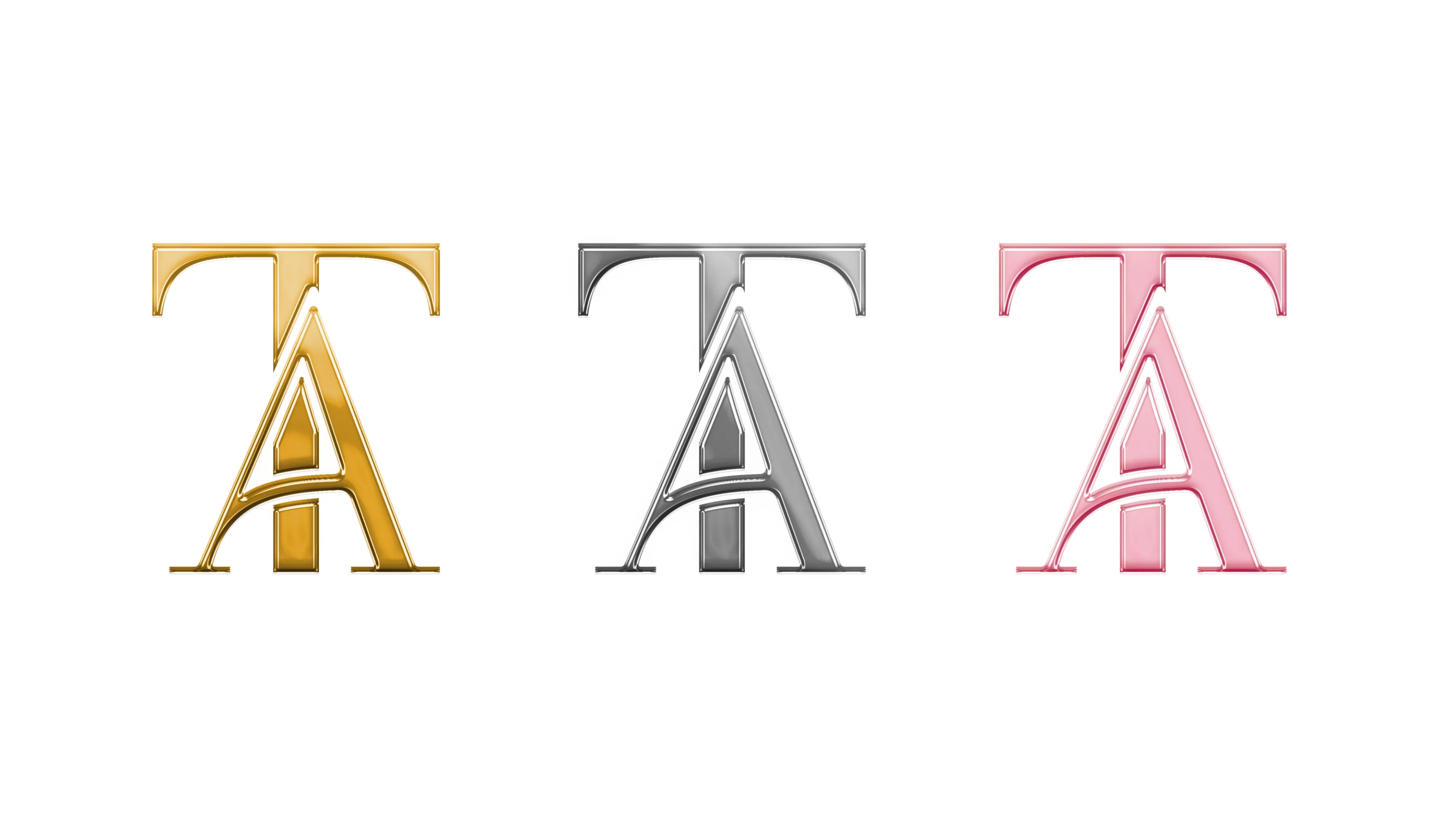
受浪漫主义影响,1800-1850年间,欧洲诞生了如今耳熟能详的浪漫童话故事,如格林童话与安徒生童话。从故事书的封面设计中汲取灵感,字母中延伸的浪漫线条和带有弧度的衬线,以及笔画间的连接方式,注入到logo字型细节的设计。
从欧式建筑中寻找视觉灵感。提取建筑中流动、精致的线条,来修饰“A”的衬线和连接处的细节。“T”的轮廓灵感来源于画面中装饰性的边框,以柔和的线条勾勒出衬脚,并体现出对称的美感。
整体字型设计保留了手写体的书写特征,希望它能赋予字型更加细腻的情感表达,这种具有浪漫感的线条构成注入到整体字型当中。
INSPIRED BY EUROPEAN ROMANTIC TALES (1800–1850) SUCH AS THE GRIMM AND ANDERSEN FAIRYTALES, THE LOGO DESIGN DRAWS FROM STORYBOOK COVERS AND ROMANTIC TYPOGRAPHY DETAILS — FLOWING SERIFS, CURVED LINES, AND CONNECTIVE STROKES. VISUAL ELEMENTS FROM EUROPEAN ARCHITECTURE ENHANCE THE LETTERFORMS: THE “A” FEATURES ELEGANTLY SCULPTED SERIFS, WHILE THE “T” TAKES SHAPE FROM ORNAMENTAL FRAMES. RETAINING HANDWRITTEN CHARACTERISTICS, THE DESIGN INFUSES A SENSE OF ROMANCE AND EMOTIONAL FINESSE INTO THE TYPEFACE.